chulai wrote:You might have another conflicting rule causing that issue.
Even after removing all the qt css entries including the outerframe changes and keeping only the grouplist changes still shows that issue. I am using the portable linux version and changing the files in .goldendict in my home directory.
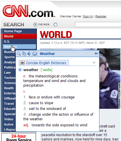
Also what is the name of the top panel (popup) if I need to use it on the css? I am trying to remove the padding on that as well.
chulai wrote: I'm more worry about the display style in the results. I have tweaked the Babylon style that was introduced some months ago.
I like the new babylon style with the logo etc. (I am not sure if your changes are in the existing linux portable yet) but I use the lingvo style just because it takes less space. It adds the headword and the dict name on a single line thus saving space.
Since we are on that topic, I always thought the display of headwords in each dictionary content is repetitive. Most dictionaries have the word in the content itself. Also the top panel/tab etc. have the headword always displayed. So, we could save some space removing it. Just my thoughts