Usability request: thin borders for popup window.
Thick borders for popup windows is just useless
PS: Thanks, for great app)))
New user registration is currently disabled due to spam abuse / Регистрация новых пользователей в настоящее время приостановлена из-за злоупотреблений спаммерами
[Usability request]: thin borders for popup window
10 posts
• Page 1 of 1
[Usability request]: thin borders for popup window
![]() by alexqwesa » Fri Aug 10, 2012 4:39 am
by alexqwesa » Fri Aug 10, 2012 4:39 am
- alexqwesa
- Posts: 4
- Joined: Fri Aug 10, 2012 4:26 am
Re: [Usability request]: thin borders for popup window
![]() by vjjustin » Sat Aug 11, 2012 7:03 pm
by vjjustin » Sat Aug 11, 2012 7:03 pm
I second that!
- vjjustin
- Posts: 45
- Joined: Wed Feb 08, 2012 7:59 pm
Re: [Usability request]: thin borders for popup window
![]() by chulai » Mon Aug 13, 2012 1:00 pm
by chulai » Mon Aug 13, 2012 1:00 pm
Are you pinning down the popup window by any chance? Please provide a picture.
- chulai
- Posts: 464
- Joined: Sat Jan 08, 2011 10:11 pm
Re: [Usability request]: thin borders for popup window
![]() by vjjustin » Mon Aug 13, 2012 2:34 pm
by vjjustin » Mon Aug 13, 2012 2:34 pm
I don't know about him but I don't.
See the image below (with default gnome 3 fedora theme)

For comparison, see how beautiful the lingoes popup (and borders). It 'feels' much more lightweight and fresh.
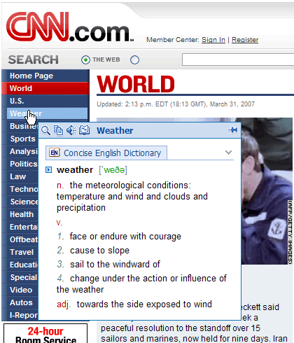
Our popup looks and feels like a window not as a popup. The border thickness can greatly improve the appearance and is a great starting point. Please remove the borders completely, if possible. A line will do just fine.
See the image below (with default gnome 3 fedora theme)
For comparison, see how beautiful the lingoes popup (and borders). It 'feels' much more lightweight and fresh.
Our popup looks and feels like a window not as a popup. The border thickness can greatly improve the appearance and is a great starting point. Please remove the borders completely, if possible. A line will do just fine.
- vjjustin
- Posts: 45
- Joined: Wed Feb 08, 2012 7:59 pm
Re: [Usability request]: thin borders for popup window
![]() by chulai » Sat Aug 18, 2012 11:41 pm
by chulai » Sat Aug 18, 2012 11:41 pm
Hi, it's not the border what you see in gray there but the padding and margin of the container. You can eliminate these by adding the following CSS rule in the qt-style.css file in your configuration folder:
You can find your configuration folder by going to Help > Configuration folder. If you don't have a qt-style.css file there, then just create the text file.
Regards,
Chulai
- Code: Select all
ScanPopup #outerFrame
{
   /* background-color: #EDECEB; */
   margin-left: -9px;
   margin-right: -9px;
   margin-bottom: -9px;
}

ScanPopup #groupList
{
   margin-left: 9px;
}

ScanPopup #pinButton
{
   margin-right: 9px;
}
You can find your configuration folder by going to Help > Configuration folder. If you don't have a qt-style.css file there, then just create the text file.
Regards,
Chulai
- chulai
- Posts: 464
- Joined: Sat Jan 08, 2011 10:11 pm
Re: [Usability request]: thin borders for popup window
![]() by vjjustin » Sun Aug 19, 2012 6:52 am
by vjjustin » Sun Aug 19, 2012 6:52 am
That did the trick! Why oh why this isn't the default behaviour?
The padding of the groupList made the combobox out of sync with the text. How can we correct it?

I still prefer a design with no weight (Widgets with 3d-effect is so old style) added to the widgets, top panel etc. See the image below to understand what I mean. But for that we will have to use custom widgets, I guess.

The padding of the groupList made the combobox out of sync with the text. How can we correct it?
I still prefer a design with no weight (Widgets with 3d-effect is so old style) added to the widgets, top panel etc. See the image below to understand what I mean. But for that we will have to use custom widgets, I guess.
- vjjustin
- Posts: 45
- Joined: Wed Feb 08, 2012 7:59 pm
Re: [Usability request]: thin borders for popup window
![]() by chulai » Sun Aug 19, 2012 8:13 pm
by chulai » Sun Aug 19, 2012 8:13 pm
vjjustin wrote:That did the trick! Why oh why this isn't the default behaviour?
I suppose this is the first time someone makes a comment on this. But anybody can change the look and feel without needing a new GoldenDict version released. Anyhow, I don't want to change the default look unless there is an important demand to do so.
vjjustin wrote:The padding of the groupList made the combobox out of sync with the text. How can we correct it?
I'm not experiencing this behaviour at all. In my case it works just fine. Might I suggest you look at your CSS rules? You might have another conflicting rule causing that issue.
vjjustin wrote:I still prefer a design with no weight (Widgets with 3d-effect is so old style) added to the widgets, top panel etc. See the image below to understand what I mean. But for that we will have to use custom widgets, I guess.
Personally I don't care too much about widgets. I think the default look & feel for them is good. I'm more worry about the display style in the results. I have tweaked the Babylon style that was introduced some months ago.
I would say you don't need custom widgets, you can just style the existing one with CSS. Just google "qt css" or "qt style sheets". You can even style sub-controls such as the drop-down button in a combobox.
- chulai
- Posts: 464
- Joined: Sat Jan 08, 2011 10:11 pm
Re: [Usability request]: thin borders for popup window
![]() by vjjustin » Mon Aug 20, 2012 7:46 am
by vjjustin » Mon Aug 20, 2012 7:46 am
chulai wrote:You might have another conflicting rule causing that issue.
Even after removing all the qt css entries including the outerframe changes and keeping only the grouplist changes still shows that issue. I am using the portable linux version and changing the files in .goldendict in my home directory.
Also what is the name of the top panel (popup) if I need to use it on the css? I am trying to remove the padding on that as well.
chulai wrote: I'm more worry about the display style in the results. I have tweaked the Babylon style that was introduced some months ago.
I like the new babylon style with the logo etc. (I am not sure if your changes are in the existing linux portable yet) but I use the lingvo style just because it takes less space. It adds the headword and the dict name on a single line thus saving space.
Since we are on that topic, I always thought the display of headwords in each dictionary content is repetitive. Most dictionaries have the word in the content itself. Also the top panel/tab etc. have the headword always displayed. So, we could save some space removing it. Just my thoughts
- vjjustin
- Posts: 45
- Joined: Wed Feb 08, 2012 7:59 pm
Re: [Usability request]: thin borders for popup window
![]() by chulai » Mon Aug 20, 2012 1:03 pm
by chulai » Mon Aug 20, 2012 1:03 pm
vjjustin wrote:Even after removing all the qt css entries including the outerframe changes and keeping only the grouplist changes still shows that issue. I am using the portable linux version and changing the files in .goldendict in my home directory.
This is a platform-specific behavior. I didn't know you were using Fedora Linux. Try changing style to:
- Code: Select all
ScanPopup #groupList
{
   margin-left: 5px;
   padding-left: 10px;
   border: 0px;
}
vjjustin wrote:Also what is the name of the top panel (popup) if I need to use it on the css? I am trying to remove the padding on that as well.
There is no such thing as a top panel. It is all embedded (buttons and result frame) in the same layout widget. See picture:
- scanpopup goldendict.JPG (76.59 KiB) Viewed 20841 times
Highlighted in yellow are the widget's objectName which you can use as CSS Ids to style the widgets.
vjjustin wrote:Since we are on that topic, I always thought the display of headwords in each dictionary content is repetitive. Most dictionaries have the word in the content itself. Also the top panel/tab etc. have the headword always displayed. So, we could save some space removing it. Just my thoughts
Why don't you just remove them with CSS in article-style.css ?
- Code: Select all
.dsl_headwords p
{
  display: none;
}
This is only for Lingvo DSL dictionaries. Save the results as html file, open it with a Web Browser and use some inspect tools to look for the CSS id and class you have to use for other dictionaries.
- chulai
- Posts: 464
- Joined: Sat Jan 08, 2011 10:11 pm
Re: [Usability request]: thin borders for popup window
![]() by vjjustin » Tue Aug 21, 2012 6:40 am
by vjjustin » Tue Aug 21, 2012 6:40 am
Chulai, thanks for your wonderful work and help; Long live!
- vjjustin
- Posts: 45
- Joined: Wed Feb 08, 2012 7:59 pm
10 posts
• Page 1 of 1
Who is online
Users browsing this forum: No registered users and 47 guests